(no subject)
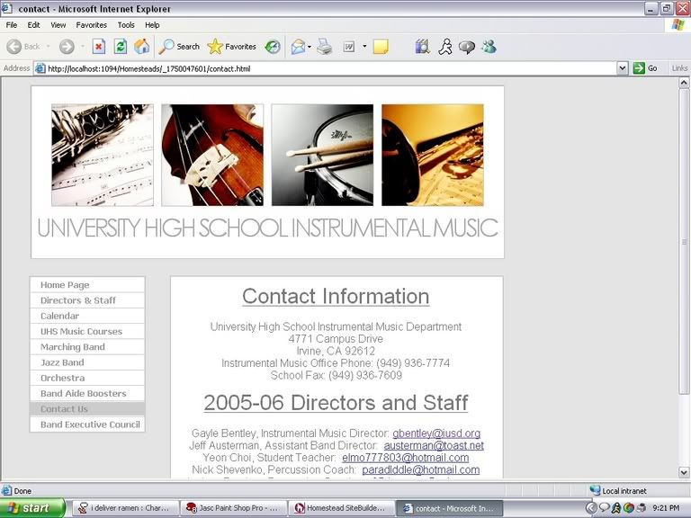
Aug. 28th, 2005 09:46 pmAll right, so I need to ask all of you on my friends list to take a look at the layout I'm making for the band website and give me any criticisms: http://img.photobucket.com/albums/v117/charmedwillow/Image2.jpg
Tell me what you like, what you don't, etc. Keep in mind, though, that I can't use HTML with homestead (well I kind of can, but not really. If that makes any sense), I have to use a stupid sitebuilder, so my options are limited. I could probably make it look better if I could do it all with HTML. Oh well. But yeah. Four of my friends have seen it and they all liked it, and both my parents have seen it, and while my dad liked it, my mom thought the background was too pale, it was too grey and white, and the text wasn't dark enough. But then I changed the background to something ugly and she thought it looked better, so I'm not really taking her opinion into consideration anymore. ;) But yes, I'd be eternally grateful if you could all give me comments on it. I'm also going to send it to Mrs. Bentley to see what she thinks, since she gets the ultimate say, but hotmail's being a bitch right now and won't open, so I'm waiting till tomorrow to try to send it.
Tell me what you like, what you don't, etc. Keep in mind, though, that I can't use HTML with homestead (well I kind of can, but not really. If that makes any sense), I have to use a stupid sitebuilder, so my options are limited. I could probably make it look better if I could do it all with HTML. Oh well. But yeah. Four of my friends have seen it and they all liked it, and both my parents have seen it, and while my dad liked it, my mom thought the background was too pale, it was too grey and white, and the text wasn't dark enough. But then I changed the background to something ugly and she thought it looked better, so I'm not really taking her opinion into consideration anymore. ;) But yes, I'd be eternally grateful if you could all give me comments on it. I'm also going to send it to Mrs. Bentley to see what she thinks, since she gets the ultimate say, but hotmail's being a bitch right now and won't open, so I'm waiting till tomorrow to try to send it.
no subject
Date: 2005-08-29 04:55 am (UTC)no subject
Date: 2005-08-29 05:07 am (UTC)no subject
Date: 2005-08-29 04:58 am (UTC)i really love the header.
no subject
Date: 2005-08-29 05:08 am (UTC)no subject
Date: 2005-08-29 05:10 am (UTC)no subject
Date: 2005-08-29 05:27 am (UTC)no subject
Date: 2005-08-29 06:33 am (UTC)no subject
Date: 2005-08-29 11:52 pm (UTC)no subject
Date: 2005-08-29 09:36 am (UTC)no subject
Date: 2005-08-29 11:53 pm (UTC)no subject
Date: 2005-08-29 11:01 am (UTC)no subject
Date: 2005-08-29 11:54 pm (UTC)no subject
Date: 2005-08-29 12:31 pm (UTC)no subject
Date: 2005-08-29 11:54 pm (UTC)no subject
Date: 2005-08-29 01:28 pm (UTC)no subject
Date: 2005-08-29 11:55 pm (UTC)